Here's How You Can Spend Six Hours At PS1's Greater New York Show
I should say "here's how you could have had spent six hours" since the exhibition just closed, but you get the idea . . .
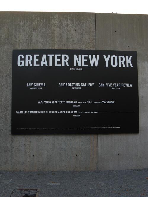
I took Mom and Dad to the Greater New York show because they had never seen PS1 before and because the show is/was pretty good — Jen and I spent a couple of hours there the week before and there were some interesting pieces.
And while I remembered that there were some longer video installations, I don't think the fact of just how long they were really sunk in until I walked through the exhibition with Mom, who began the afternoon by dutifully watching Deville Cohen's 18-minute-long "Grayscale (A Video in Three Acts)" in its entirety. This isn't to say that "Grayscale" isn't interesting — it is! — I liked, for example, how Cohen used office supplies to create props and a set for the video — that was cool. It's just that I think I "got" what was going on by only sitting through the last half of the third act — maybe five minutes instead of the full 18. Or not . . .
This is when it occurred to me that if you sit through the entirety of all of the video installations, you could spend a long, long time at PS1. Which is how I got the idea to count the all the minutes listed in the placard information — it turns out that there were five hours, twenty minutes and seventeen seconds of video installations. This doesn't even include the Alex Hubbard, Leigh Ledare, Rashaad Newsome and Sharon Hayes installations, which didn't have times listed but which probably added at least another half hour to the total (nor does it include the GNY 5 Year Review, which had probably about two more hours of video in a separate gallery). Which is to say, if you were to have visited the Greater New York Show, it would take you six hours just to view the video installations:
- Lucy Raven (1) (51:30)
- Lucy Raven (2) (10:40)
- Kalup Linzy (52:55)
- Alex Hubbard (no time listed)
- Emily Roysdon (7:51)
- Deville Cohen (18:00)
- Leidy Churchman (1) (20:00)
- Leidy Churchman (2) (20:00)
- DETEXT (3:30)
- Conrad Ventur (4:00)
- Rashaad Newsome (no time listed)
- Brody Condon (1) (20:00)
- Brody Condon (2) (7:00)
- Ryan McNamara (5:11)
- Gilad Ratman (8:11)
- Tommy Hartung (15:36)
- Elisabeth Subrin (6:00)
- Liz Magic Laser (22:00)
- robbinschilds (6:45)
- Dani Leventhal (16:00)
- Maria Petschnig (20:00)
- LaToya Ruby Frazier (3:26)
- Tala Madani (1) (0:34)
- Tala Madani (2) (0:45)
- Tala Madani (3) (0:23)
- Leigh Ledare (1) (no time listed)
- Leigh Ledare (2) (no time listed)
- Sharon Hayes (no time listed)
Now PS1 is only open from 12 to 6. And since I don't think the curators intended for you to visit the exhibition over the course of several days, I guess it's important to assume that maybe — maybe? — the artists didn't intend for you to view the entirety of each piece. I have a hard time believing this, however, because for every piece like Brody Condon's "20die" — seven minutes of someone shaking a 20-sided die in a glass — there is something like the Deville Cohen piece, which has a sort of narrative. Or the four-episode, 52-plus-minute Kalup Linzy videos. Or Liz Magic Laser's 22 minutes of playing with a da Vinci Surgical System (which was actually quite entertaining). Then there is the 16-minute-long Dani Leventhal installation, which seems to have a narrative as well, though it's not clear whether it's OK to drop in and out of it.
Then you think that if you do happen to drop in and out of a video installation, are you also missing the point? You wouldn't start watching "24" eight hours into the season, then just go back and watch the stuff you missed. So then there's the issue of hitting the pieces at their beginning. At least one of the pieces — one of the best pieces, in my mind — actually plays on this idea: Elisabeth Subrin's "Lost Tribes and Promised Lands" starts with two images side by side of the same Williamsburg streetscape. In general they are the same spot but it's clear from different clues — the same billboard in the background is advertising something different, for example — that they were taken at two different dates. If you started in the middle of the piece it takes a while to figure out what is different and your preconceptions take over — maybe it's showing gentrification or who knows . . . but eventually you notice that the through-line in all of the images is the American flag, and when you finally get to the beginning of the piece, Subrin "reveals" what's going on — the two films were taken on the same Saturday in October, one in 2001 and one in 2008. So of course it's really showing the images of patriotism and how those expressions (mostly) faded seven years after 2001. One of the best sets has a vinyl-sided house on the earlier side with an American flag and an Italian flag hanging there (this is Columbus Day weekend); the later side only has the Italian flag.
Subrin's piece is brilliant on a lot of levels. One, as a historical piece — you may have forgotten about all those Osama bin Laden posters in the bodega windows — and it's interesting to see the gentrification subtext that is in there (I think). Two, it expresses in that dull summer-to-fall way that things sort of peter out in a stubbornly silent way (OK, that's my interpretation). And three, it takes advantage of and actually encourages you to drop in the installation in the middle, because it makes the experience is that much better. Four, it's only six minutes versus, say, 52 minutes . . .
So yeah, the mind reels at how long you could spend — which brings up the topic of the rest of the works in the show — the "untimed" art, as it were. Dad mentioned afterward that he had been told by people that the average time someone spends in front of a painting is four seconds. I think this comes from Blake Gopnik's article in the Washington Post back in 2001 where he sat down at the Alberto Giacometti MoMA exhibit and timed how long someone read the explanatory text (50 seconds on average) versus actually looking at the piece (in his estimation, an average of four seconds). As someone who frequently spends only about four seconds in front of a painting, this doesn't surprise me. And during the Greater New York show, there were probably very few "untimed" works that I spent more than, say, four seconds in front of (if that — a lot of time I probably just cruised by some stuff). Maybe video art is a way of recapturing some of that attention deficit . . .
In 2009 the Times' Michael Kimmelman expanded on Gopnik's observation and also added the digital camera dimension — basically that digital cameras have taken the place of sketchbooks. But I think that digital cameras at least provide a way of interacting with art on a tiny bit of a deeper level. Plus, it's funny looking:
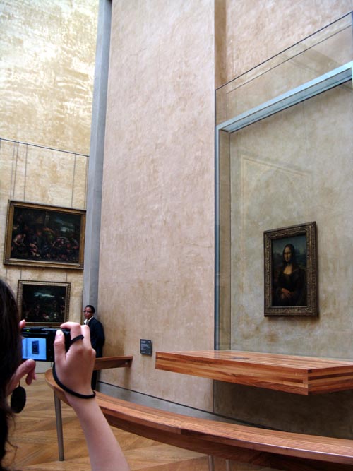
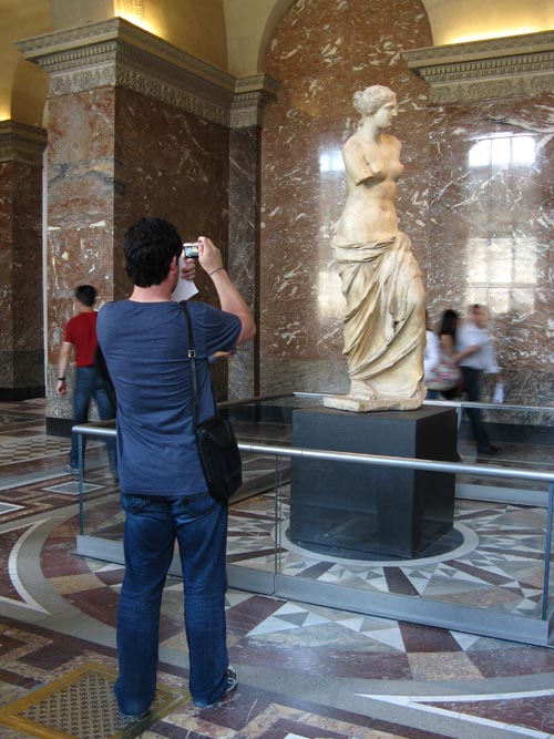
Like I said, I'm not above cruising by an untimed work of art. I accept that this image, for example, only requires a modicum of attention:
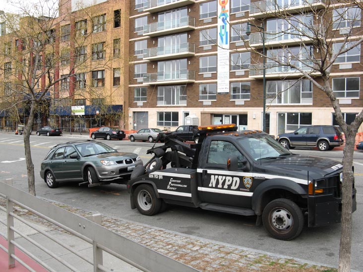
While this video of the same thing may (or may not) mesmerize you for the full 8-plus minutes:
They're the same "idea" — I get that — though maybe part of the middle there might have been OK to edit out — but there's something to the idea that if I give you something eight minutes long you might feel compelled to watch the whole eight minutes. No one tells you when to drop in or out.
Mom will say that she didn't sit through all of the video pieces — elsewhere on the first floor she only watched a few minutes of Lucy Raven's one hour, one minute and ten seconds of video (two separate components of one of the gallery spaces) — but it certainly seemed like we spent a lot of time on the video installations. And obviously it made me wonder . . .
Location Scout: PS1.
Posted: October 19th, 2010 | Author: Scott | Filed under: Back Of Napkin | Tags: Museums, Tow Trucks, Video Art

